
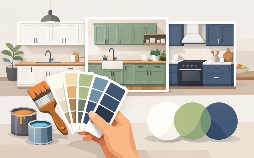
A cabinet color can make the same kitchen feel larger, warmer, brighter, or more tailored without changing the layout at all. If you are wondering what color to paint kitchen cabinets, start with the parts of your kitchen that are not changing: the countertops, backsplash, flooring, wall color, and natural light. The best choice is not always the color currently trending online. It is the one that works with your home, your daily routine, and the level of upkeep you are comfortable with.
For many Charlotte homeowners, professional cabinet refinishing is a practical alternative to replacement. A thoughtful color update can give a dated kitchen a polished new direction while avoiding demolition, lengthy construction, and the cost of installing all-new cabinetry.
Start With the Fixed Finishes
Cabinets occupy a lot of visual space, but they should not compete with the permanent materials around them. Before choosing paint, bring home color samples and hold them directly against your countertop and backsplash at different times of day. A white that looks crisp in a showroom can look yellow next to cool gray quartz, while a soft greige may suddenly look too muddy beside warm travertine or honey-toned flooring.
Undertones matter more than most homeowners expect. White paints may lean warm, cool, gray, creamy, or slightly green. Grays can have blue, violet, or beige undertones. Dark colors are not exempt either: navy may read nearly black in low light, and some charcoal shades reveal a noticeable blue or brown cast beside the wrong countertop.
Natural light also changes the answer. Kitchens with large windows, bright southern exposure, or open sightlines can handle deeper colors well. A smaller kitchen with limited daylight may benefit from lighter cabinets that reflect more light and reduce the visual weight of the room. In homes around Ballantyne and South Park, where many kitchens open directly into living and dining areas, it is also worth considering how the cabinet color will look from the sofa, breakfast table, and entryway.
What Color to Paint Kitchen Cabinets for a Lasting Look
The most reliable cabinet colors are usually flexible neutrals, but neutral does not have to mean plain. A lasting choice should complement the house rather than lock it into one short-lived trend.
Warm white for a clean, welcoming kitchen
Warm white remains a strong choice because it brightens the kitchen while feeling softer than stark, high-contrast white. It works especially well with warm wood floors, brass hardware, marble-look countertops, and traditional or transitional homes. Creamy white cabinet colors can make a kitchen feel inviting, but they need to be selected carefully. If the paint is too yellow, it can make bright white countertops or backsplash tile look dull by comparison.
A clean white can be right for a more contemporary kitchen, particularly with black hardware, cool stone, or stainless steel appliances. The trade-off is that pure white can show cooking splatters, fingerprints, and wear more readily in a busy family kitchen. A durable, professionally applied finish makes cleaning easier, but no color is completely maintenance-free.
Greige and taupe for softness without looking dated
Greige sits between gray and beige, making it one of the most forgiving choices for homeowners who want a neutral with more depth than white. It can connect warm flooring and cooler countertops in the same room, which is useful in kitchens where not every finish was chosen at the same time.
Taupe and mushroom tones offer a similar benefit with a slightly warmer, more tailored appearance. These shades can feel sophisticated in a kitchen with brushed brass, polished nickel, black, or bronze hardware. The key is to sample generously. A greige that looks balanced on a small paint chip can look very different when it covers every cabinet door.
Soft gray for a traditional or transitional home
Soft gray cabinets can still look refined, especially when the surrounding finishes lean cool and the kitchen has good natural light. They pair easily with white or gray countertops and can give traditional raised-panel cabinetry a more current appearance.
However, gray is more dependent on undertones than many people realize. Cool blue-gray can feel sharp against warm beige tile or red oak floors. If your kitchen already has warm fixed finishes, a warmer gray or greige will usually create a more cohesive result.
Navy, deep green, and charcoal for character
A darker cabinet color can add depth and make standard cabinetry look more custom. Navy, deep forest green, charcoal, and near-black are popular for islands and lower cabinets because they anchor the room without making upper cabinets feel heavy.
Dark cabinets are not only for large kitchens, but the balance has to be right. Pairing deep lower cabinets with light uppers, a bright backsplash, or warm wood accents helps keep the room open. Dark finishes can also show dust, scratches, and grease marks more easily than mid-tone neutrals, especially on doors near the range, trash pullout, and dishwasher. This is one reason surface preparation and coating quality matter just as much as the paint color.
Consider a Two-Tone Cabinet Design
Two-tone cabinets are a smart option when you want contrast without committing the entire kitchen to a bold color. Light upper cabinets keep the room bright, while darker lower cabinets or an island create visual interest at eye level and below.
White or warm greige uppers with navy, green, or charcoal lowers are a dependable combination. Another approach is painted perimeter cabinets with a stained-wood island, particularly when you want to retain warmth in an open-concept home. Two-tone kitchens work best when the colors share a common undertone and are repeated elsewhere through hardware, lighting, stools, or nearby furnishings.
Avoid choosing two colors just because they are individually appealing. If both colors are strong, the kitchen can feel busy. Usually, one color should serve as the quiet foundation and the other should provide the contrast.
Match the Color to Your Kitchen’s Daily Use
The right cabinet color should support real life, not just look good in photos. Before finalizing a color, consider these practical questions:
- How much direct sunlight does the kitchen receive during the day?
- Are there young children, pets, or frequent cooks using the space?
- Will the painted cabinets connect visually to an open living area?
- Do you plan to keep the existing countertops, flooring, and backsplash?
- Are you updating hardware, lighting, or wall color at the same time?
For a busy household, mid-tone colors such as greige, soft taupe, and medium-depth green can be especially practical. They tend to hide everyday marks better than bright white or near-black. Still, color should not be chosen only for concealment. A quality cabinet finish should be easy to wipe clean, resist yellowing, and stand up to normal kitchen use.
Why the Finish Is as Important as the Color
Even the best color choice will disappoint if the coating fails. Cabinet painting is not the same as rolling wall paint onto doors. Cabinet surfaces need thorough cleaning to remove kitchen oils, careful sanding for adhesion, the appropriate primer, and durable furniture-grade coatings applied in controlled coats.
Fine-spray equipment helps create the smooth, even appearance homeowners expect from refinished cabinets. It also helps avoid the brush marks and uneven texture that can make a kitchen look like a weekend project rather than a long-term improvement. Doors, drawer fronts, and cabinet boxes all need consistent preparation, and details such as hinges, hardware placement, and protected work areas affect the final result.
At Icarus Pro Painters, cabinet refinishing is approached as a complete process, not a quick color change. Proper preparation and high-quality coatings help the finish hold up against peeling, blistering, chipping, and the normal demands of a family kitchen.
Test Colors Before You Commit
Paint samples are a small investment that can prevent a costly change of direction. Test large sample boards or peel-and-stick samples near the backsplash, countertop, and floor. View them in morning light, afternoon light, and with your usual overhead lighting turned on. If possible, place a sample on a cabinet door rather than evaluating it only on the wall.
Pay attention to adjacent rooms, too. An open kitchen does not need to match the living room exactly, but the colors should feel intentional together. A cabinet color that is beautiful on its own can feel disconnected if it clashes with the undertones in nearby flooring, built-ins, or furniture.
The best cabinet color is one you will still enjoy after the initial excitement wears off. Choose a shade that respects the materials already in your home, fits the way your household uses the kitchen, and is finished with the level of care a central gathering space deserves.
Recent Comments