
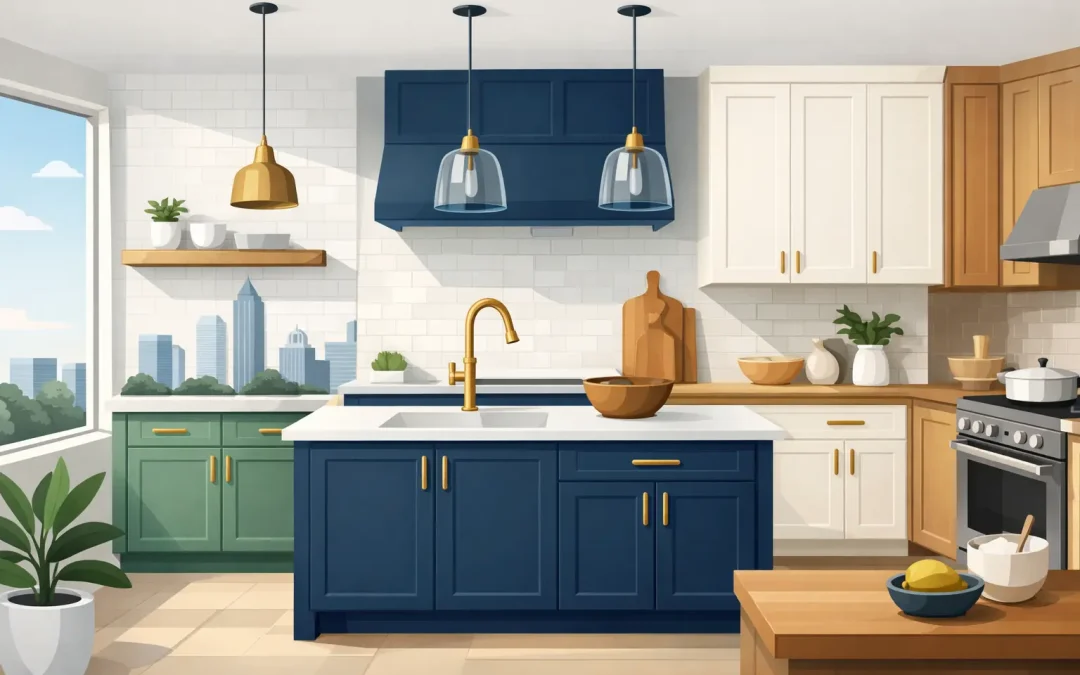
A cabinet update can change the entire feeling of a kitchen without changing its footprint. The right cabinet color ideas can make a dark room feel open, bring warmth to a builder-grade space, or give a well-loved kitchen the tailored look it deserves. For Charlotte homeowners, the best choice is rarely about chasing one trend. It is about choosing a color that works with your home’s light, floors, counters, and daily life.
Professional cabinet refinishing gives you room to make that change without the expense, demolition, and extended disruption of replacement. With careful cleaning, sanding, priming, and furniture-grade spray finishing, existing cabinet boxes can become the polished foundation of a fresh kitchen or bathroom.
Cabinet Color Ideas That Work in Charlotte Homes
Charlotte homes range from traditional brick properties in SouthPark to newer transitional homes in Ballantyne, and cabinet colors should feel connected to the home rather than copied from a showroom display. A beautiful sample can look completely different once it is surrounded by your backsplash, granite, hardwood, and natural light.
Warm white for a clean, welcoming kitchen
Warm white remains one of the most dependable choices for cabinet refinishing. Unlike stark, cool white, a warm white has a slight cream, beige, or soft gray undertone that keeps the room from feeling sterile. It is especially effective in kitchens with tan granite, travertine-style backsplashes, warm oak flooring, or brass hardware.
White cabinets also give homeowners flexibility. You can update wall paint, stools, lighting, or a runner later without needing to repaint the cabinets. The trade-off is maintenance: bright white shows splatters and scuffs more readily around high-use areas. A durable, properly cured finish and routine gentle cleaning make a meaningful difference.
Soft greige when white feels too sharp
Greige sits between gray and beige, offering a calm neutral that works with both warm and cool materials. It can give a kitchen more depth than white while still reflecting plenty of light. For homeowners who want an elevated, current look but do not want a dramatic color, this is often the sweet spot.
The undertone matters. Some greiges lean violet, some lean green, and others read almost beige in afternoon sun. Test a large sample near the cabinets at different times of day before committing. Charlotte’s strong natural light can reveal undertones that are easy to miss under a paint store’s overhead lights.
Deep navy for contrast without harshness
Navy lower cabinets or a navy island create a sophisticated contrast against light walls and countertops. It is a strong choice for kitchens with white quartz, marble-look surfaces, warm wood accents, and polished nickel or aged brass hardware. Navy feels more classic than black, yet it still delivers a noticeable transformation.
This option works best when the room has adequate light. In a compact kitchen with limited windows, navy on every cabinet can make the space feel enclosed. Keeping upper cabinets light, using reflective countertops, or reserving navy for the island lets you enjoy the color without weighing down the room.
Muted green for a grounded, custom look
Soft sage, olive, and gray-green cabinets have become popular because they bring color into the kitchen without becoming loud. These shades pair naturally with wood floors, creamy walls, matte black hardware, and warm metallic finishes. They can also make a bathroom vanity feel calmer and more intentional.
Green is not a one-size-fits-all choice. A pale sage may disappear against a green-gray backsplash, while a dark olive can overwhelm a small bathroom. Look at the color alongside fixed surfaces first. If you are keeping your existing counters and tile, those materials should lead the decision.
Charcoal or black for a tailored statement
Dark charcoal and black cabinets can look striking in a larger kitchen, particularly when balanced with bright counters, light walls, and good lighting. They bring definition to a large island and can make simple cabinet profiles look more architectural.
They also show dust, fingerprints, and light scratches more than mid-tone colors. That does not mean dark cabinets are impractical, but they require the right expectations and a high-quality coating system. Fine-spray application helps create the smooth, even appearance that dark colors demand. Brush marks, uneven sheen, and poor prep are especially visible on black finishes.
Two-Tone Cabinet Color Ideas for More Dimension
Two-tone cabinetry is a practical design choice, not just a trend. Using a lighter color on upper cabinets and a deeper tone on lower cabinets or the island keeps the room open while adding contrast at eye level. It also gives homeowners a way to introduce personality without committing every cabinet to a bold shade.
A classic combination is warm white uppers with navy, charcoal, or muted green lowers. Another refined option is greige perimeter cabinets with a dark island. In kitchens with a natural wood floor, painted cabinets paired with a stained wood island can add warmth and prevent the room from feeling overly matched.
The key is restraint. Limit the palette to two main cabinet finishes, then let hardware, lighting, and textiles support them. Too many competing colors can make a kitchen feel busy, especially when countertops and backsplashes already have movement.
Start With What Is Staying
The cabinet color should coordinate with the materials that are hardest or most expensive to change. Before choosing a shade, consider your countertops, backsplash, flooring, wall color, appliances, and hardware. Countertops with heavy beige, gold, or brown veining generally work better with warm whites, greiges, and earthy greens than with icy gray paint.
If you plan to replace countertops soon, choose those first. Paint colors are far easier to adjust than stone slabs. If the counters are staying, bring a cabinet color sample directly into the kitchen and view it in morning light, evening light, and under the fixtures you actually use.
Hardware can also shift the final look. Brushed brass warms up white, green, and navy cabinets. Matte black offers crisp contrast with white and greige. Polished nickel is a flexible choice for traditional and transitional homes. Small changes in sheen and hardware finish can make the same cabinet color feel either casual or formal.
Choose a Finish That Can Handle Real Life
Color gets the attention, but preparation and finish quality determine whether cabinets continue looking good after the project is complete. Kitchen cabinets are exposed to cooking oils, hand traffic, moisture, cleaners, and daily impact. A quick paint job can look acceptable at first, then chip near doors, drawer edges, and handles.
A professional refinishing process begins with thorough cleaning to remove contamination. Cabinets are sanded to promote adhesion, primed appropriately, and coated with durable furniture-grade products. HVLP fine-spray equipment produces a smoother finish than typical brush-and-roll methods, particularly on cabinet doors and drawer fronts.
Sheen is another important decision. Satin is a popular balance because it has a soft, washable finish without the strong reflection of semi-gloss. A higher sheen can be easier to wipe down, but it also highlights imperfections. If your cabinet doors have visible wear, profile detail, or minor flaws, satin often gives the most forgiving result.
When to Keep the Color Safe and When to Go Bold
If you expect to sell within a few years, warm white, greige, and soft taupe are generally the safest choices. They appeal to a broad range of buyers and allow the next owner to imagine their own furnishings in the space. They are also less likely to conflict with existing granite or tile.
If you plan to stay in the home, a deeper blue, green, or two-tone layout can be a rewarding choice. Your kitchen is the heart of your home, not a staging set. The goal is not to select the most universally acceptable shade. It is to create a room that feels polished, comfortable, and right for your family.
For homeowners who are unsure, start with a bolder island or lower cabinet color and keep the uppers neutral. You get visual interest without making the entire kitchen dependent on one strong choice. Icarus Pro Painters can help homeowners weigh those options against their lighting, existing finishes, and the level of maintenance they prefer.
The best cabinet color is the one you will still enjoy when the morning light hits the counters, dinner is underway, and the kitchen is doing what it does best: bringing everyone together.
Recent Comments