
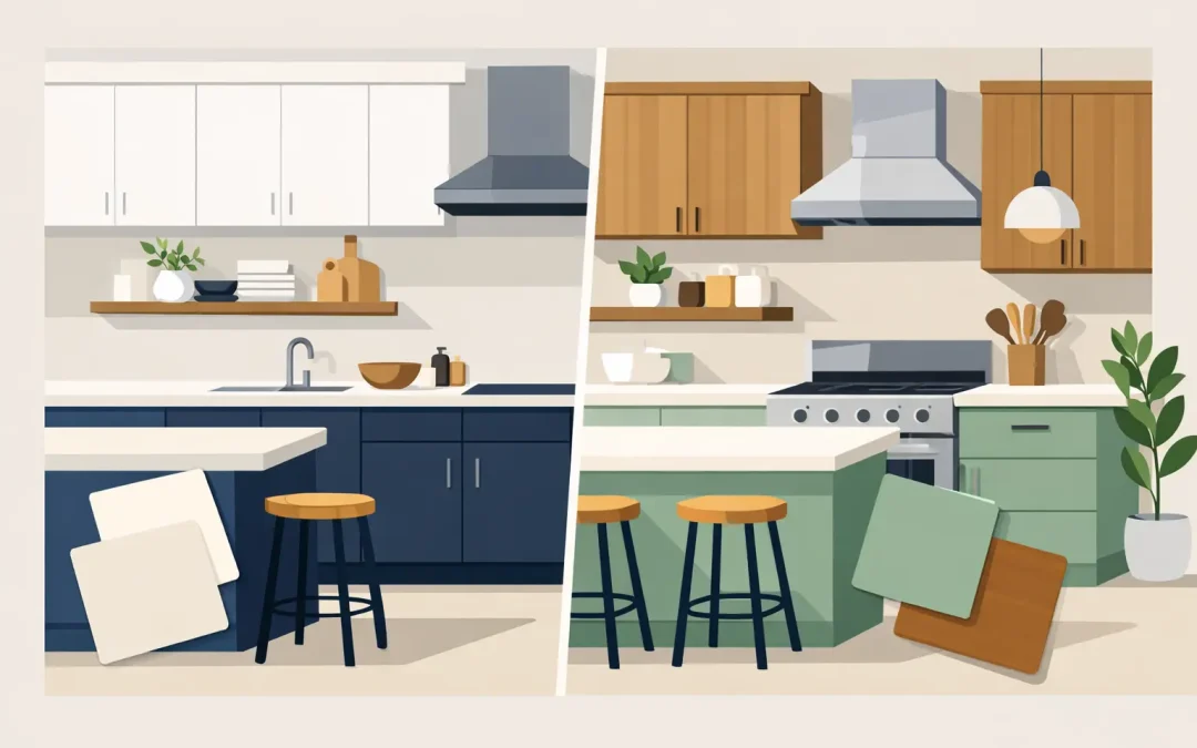
A kitchen with dark perimeter cabinets and a pale island can feel like a completely different room, even when the cabinet layout stays exactly the same. That is the appeal of two tone kitchen cabinet colors: they add dimension, brighten a dated space, and create a custom look without the cost and disruption of replacing sound cabinetry.
For homeowners in Charlotte, Ballantyne, and South Park, the best color combination is not simply the one that looks good in a photo. It needs to suit the room’s natural light, flooring, countertops, backsplash, and how the kitchen is used every day. Just as important, the finish needs professional preparation and application so the update holds up to family life.
Why Two-Tone Cabinets Continue to Work
A single cabinet color can make a kitchen feel calm and consistent. Two colors create more visual structure. The contrast can ground a large room, make upper cabinets feel lighter, or turn an ordinary island into a focal point.
The most common arrangement is light upper cabinets with darker lower cabinets. White, soft cream, warm greige, or light gray uppers keep the eye moving upward and make the kitchen feel more open. Navy, charcoal, deep green, or a rich stained-wood look on the lowers adds weight where it belongs and is often more forgiving around high-touch areas.
This approach is especially helpful in older homes with solid cabinet boxes but finishes that have yellowed, darkened, or become worn. Refinishing allows homeowners to keep the cabinets they already own while making the room feel more current. Compared with full replacement, it can save up to 75% and avoids demolition, lengthy construction, and the disruption of having a kitchen torn apart.
Still, contrast should have a purpose. A small kitchen with little daylight may not benefit from very dark lowers and dark flooring at the same time. A kitchen with dramatic busy granite may need quieter cabinet colors rather than another competing design element. The right pairing depends on the whole room, not a paint chip viewed by itself.
Two Tone Kitchen Cabinet Colors to Consider
White uppers and navy lowers
White and navy is a dependable choice for homeowners who want a clean, tailored kitchen without chasing a short-lived trend. The white uppers reflect light, while navy lowers bring enough contrast to define the cabinetry. Brushed nickel, polished chrome, or warm brass hardware can all work, depending on the rest of the home.
This pairing is particularly effective with white or light quartz countertops and a simple backsplash. Navy can show dust and smudges more readily than medium tones, so the quality and washability of the cabinet coating matters.
Warm white and soft green
Soft green lower cabinets paired with warm white uppers feel welcoming without becoming overly rustic. Think muted sage, olive-gray, or eucalyptus rather than a bright, highly saturated green. These shades work well in homes that have warm wood flooring, natural stone, aged brass, or black accents.
The undertone is where homeowners can get into trouble. A green that looks restrained under showroom lights may read much cooler or brighter in a sunny Charlotte kitchen. Test larger samples against the countertop and backsplash at different times of day before making the final choice.
Cream and charcoal
Cream uppers with charcoal or deep graphite lowers offer contrast with a softer edge than bright white and black. This combination can feel especially appropriate in traditional homes, where stark white may look disconnected from existing trim, flooring, or furnishings.
Charcoal is practical, but it is not automatically the right answer for every kitchen. If the countertop is already dark, a medium gray, muted blue, or green may give the room more separation. Cabinet colors should define the layers in the room, not cause them to blend into one heavy block.
Light greige and a natural wood island
Not every two-tone kitchen needs two painted colors. Light greige perimeter cabinets paired with a natural wood island create a layered, high-end look that is easy to live with. The wood introduces warmth, while the painted cabinets keep the room polished and light.
This choice works best when the wood tone connects to something else in the home, such as flooring, open shelving, beams, or dining furniture. Without that connection, the island can look accidental rather than intentional.
White perimeter cabinets and a dark island
For homeowners who like their existing white kitchen but want more character, painting only the island is often the most restrained two-tone update. Deep blue, green, charcoal, or black can give the island presence without committing every lower cabinet to a darker color.
This is also a good option for a kitchen with limited wall space or a more complex layout. It delivers contrast while preserving the bright, open feeling of white perimeter cabinets.
How to Choose a Pairing That Fits Your Home
Start with the elements that are hardest and most expensive to change. Countertops, tile, flooring, and fixed lighting should guide the cabinet palette. A paint color can be adjusted. A new stone countertop usually should not be chosen just to correct a cabinet color that clashes.
Pay close attention to undertones. A cool white can make a creamy backsplash look yellow. A blue-black lower cabinet may clash with a countertop that carries warm brown or gold veining. Neutral does not always mean undertone-free, and those small differences are often what make a finished kitchen feel coordinated or slightly off.
Lighting deserves equal attention. Kitchens with large windows can support deeper colors because daylight prevents them from feeling flat. Kitchens with limited natural light may look better with lighter uppers, a medium-toned lower color, and warm, well-placed lighting. Under-cabinet lights and bulb temperature can change how a color appears after sunset.
Finally, think about visual balance. If the floor is dark, lower cabinets may need to be lighter or noticeably different in tone. If the island is oversized, a darker island color can anchor it. If the room has tall upper cabinets, keeping them light prevents the kitchen from feeling top-heavy.
A Beautiful Color Scheme Needs a Durable Finish
The color choice receives most of the attention, but preparation is what determines whether cabinet refinishing looks refined and lasts. Cabinets collect cooking residue, hand oils, and cleaning-product buildup. Applying paint over those surfaces without proper cleaning and sanding is a shortcut that can lead to peeling, chipping, or an uneven finish.
A professional cabinet refinishing process should include thorough cleaning, careful surface preparation, sanding, priming where needed, and durable furniture-grade coatings. Fine-spray HVLP equipment helps create the smooth, even appearance homeowners expect from factory-finished cabinetry. Doors and drawers should not look brushy, rough, or thick around the edges.
Hardware and hinges also need a plan. Existing hardware can be reused when its finish and placement still work with the new colors. If homeowners want new pulls with a different hole spacing, that should be addressed before final coating so holes can be filled and prepared correctly. Small decisions like this are where detail-oriented work protects the final result.
At Icarus Pro Painters, cabinet refinishing is treated as a complete finish system, not a quick coat of paint. Proper prep, quality materials, and controlled spray application are what allow a two-tone design to look intentional and perform well in a busy kitchen.
Keep the Contrast Timeless, Not Temporary
A two-tone kitchen does not need to be loud to be interesting. The most lasting combinations usually rely on one familiar neutral and one deeper, more personal color. White with navy, cream with charcoal, and warm greige with natural wood remain flexible because hardware, wall color, stools, and décor can change around them over time.
If a bold color is calling your name, consider placing it on the island or lower cabinets rather than every cabinet in the room. That gives the kitchen personality while leaving enough visual breathing room. It also makes a future refresh simpler if your preferences change.
The best result is a kitchen that feels like it belongs in your home, works for the way your family uses it, and still looks carefully finished when the morning light hits the cabinet doors. Choose colors with the full room in mind, then give those colors the preparation and craftsmanship they deserve.
Recent Comments